Data Visualization
I enjoy making data visualizations. Almost all use R+ggplot2, and some use gganimate.
Additional visualizations can be found on my Twitter page.
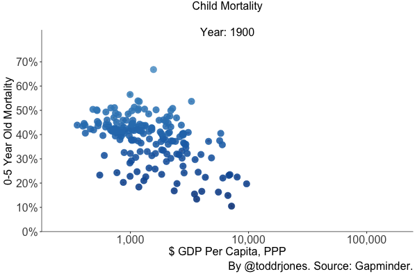
Child mortality, 1900-2016
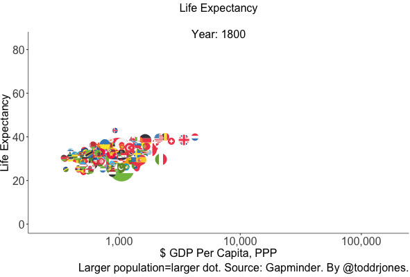
Life expectancy, 1800-2016.
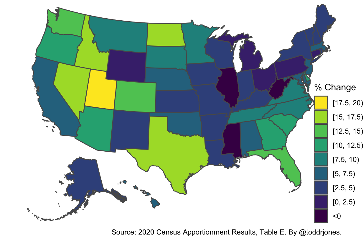
Percent change in resident population, 2020 vs. 2010.
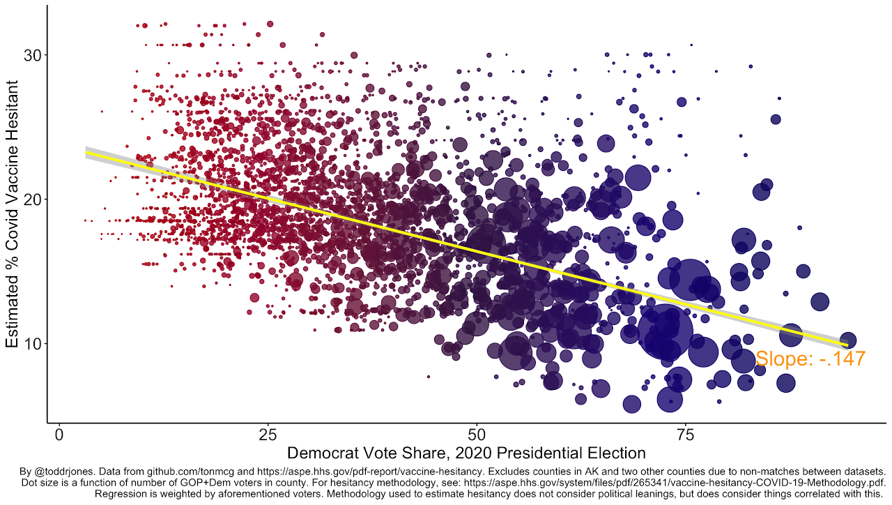
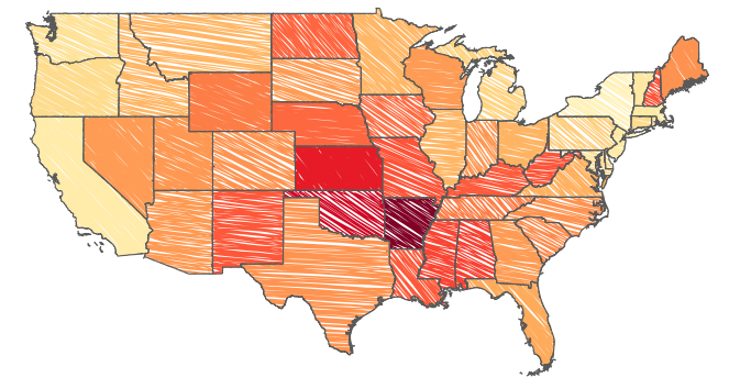
Estimated percentage of a county who are vaccine hesitant vs. 2020 Democratic presidential vote share.
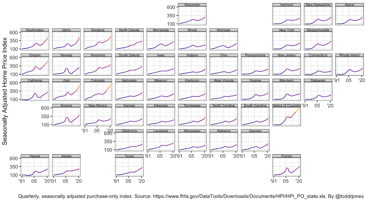
Home price index, 1991-2020.
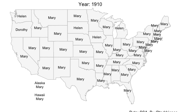
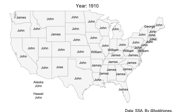
Most popular girl and boy names by state, 1910-2019.
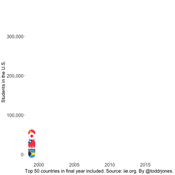
The number of international students studying in U.S. colleges each year, by country of origin, 1999-00 through 2018-19.
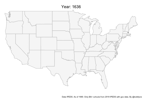
College openings, 1636–1979.
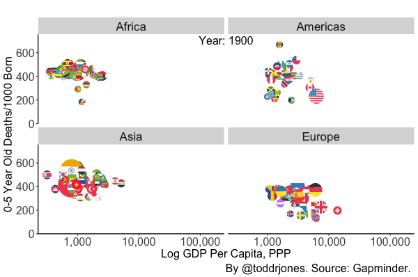
Child mortality, 1900-2016.
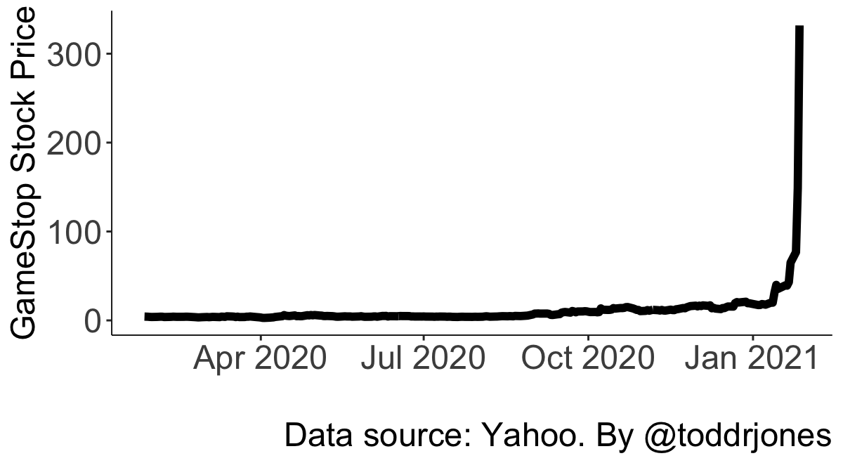
GameStop stock price.
Walmarts per million people. Darker=more. Source: Business Insider.
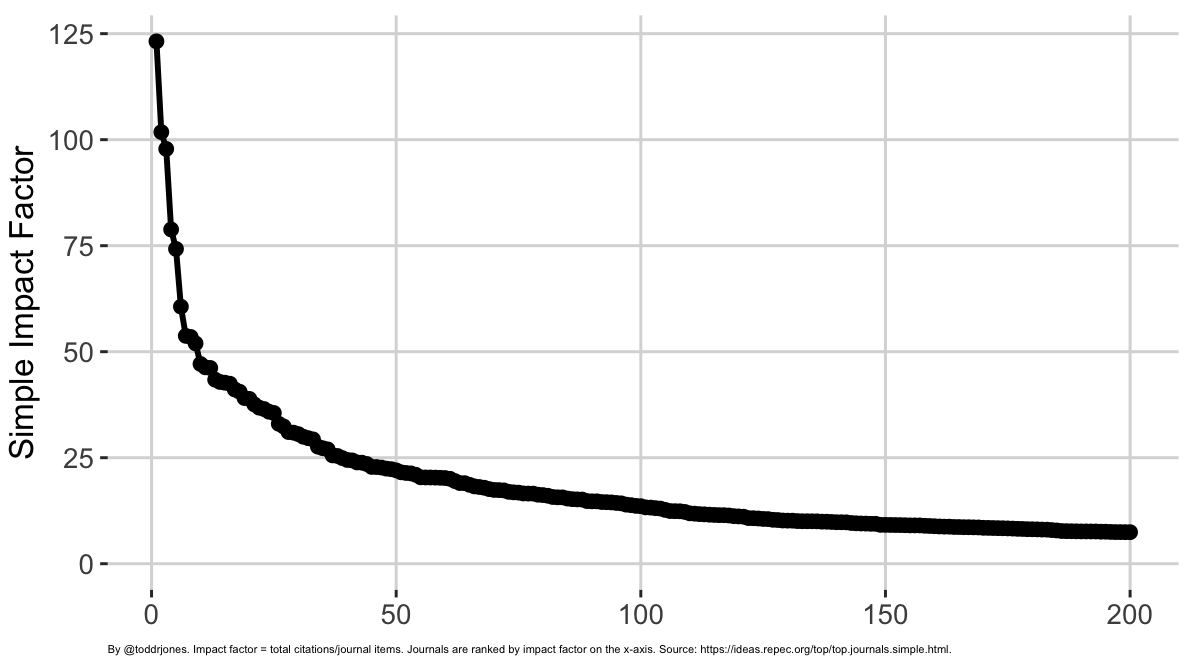
Simple impact factor of 200 economics journals.
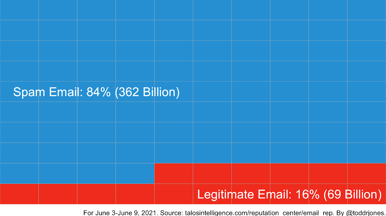
Spam vs. legitimate email, average global emails per day.
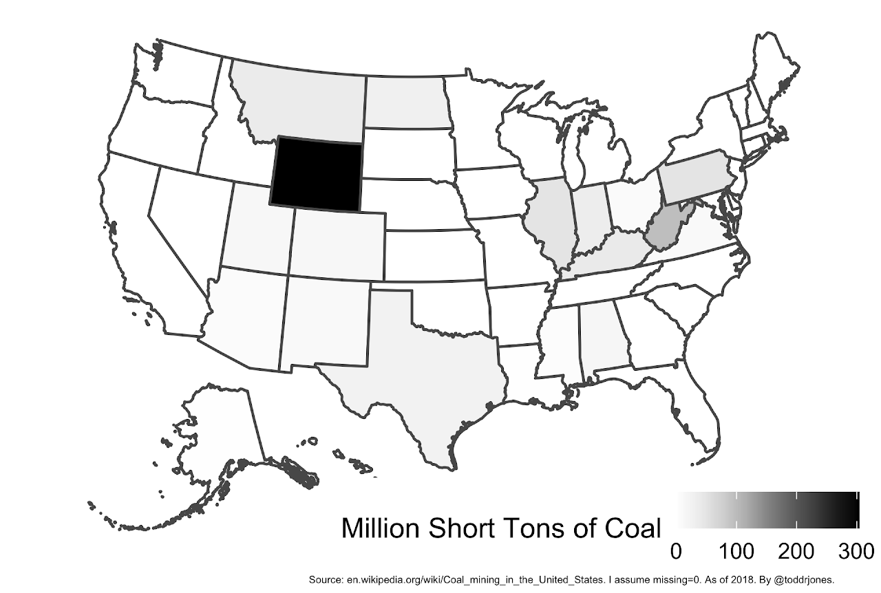
Coal production by state.
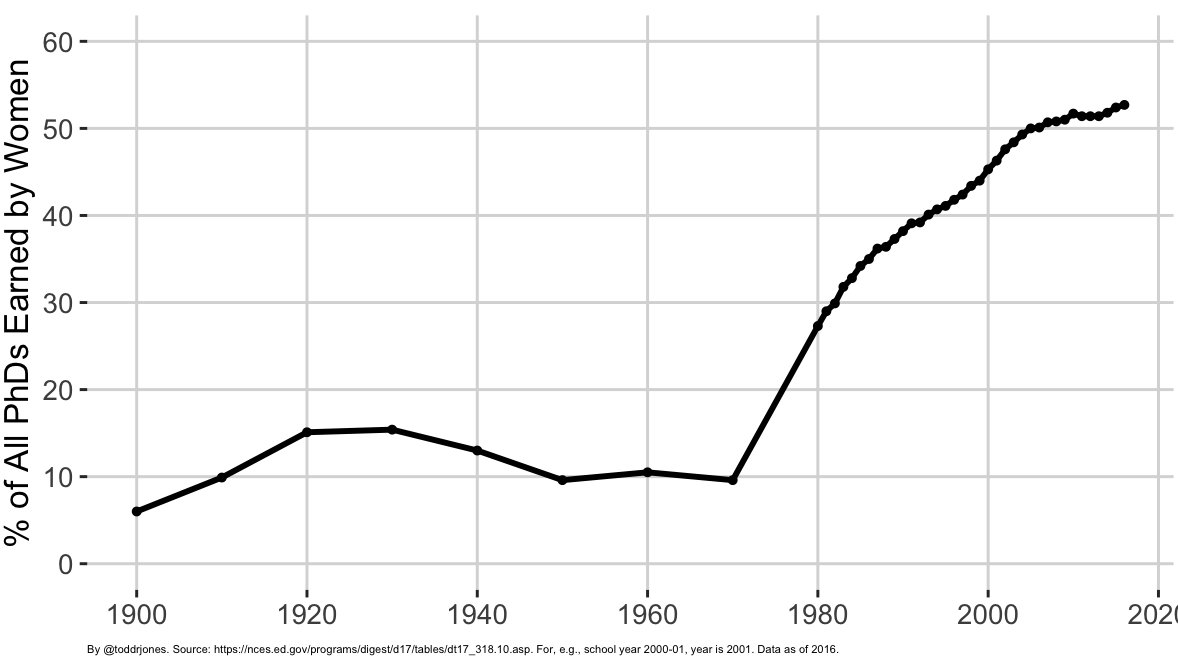
% of all PhDs earned by women over time
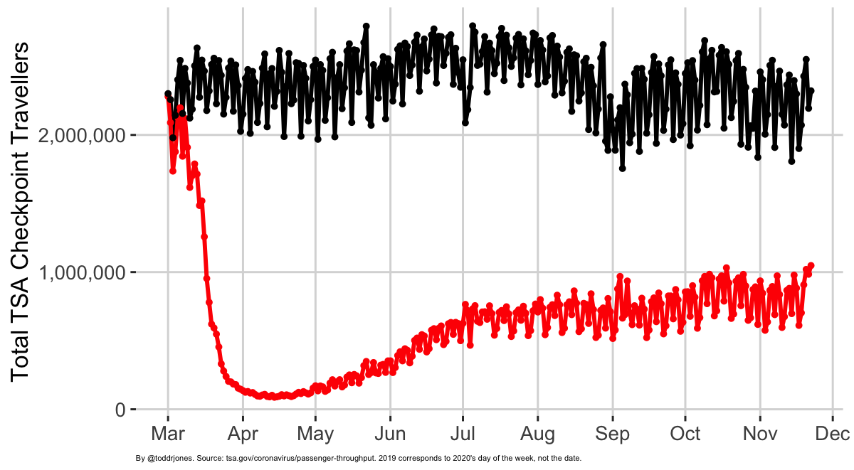
Travelers passing through TSA checkpoints by day, where red is 2020 and black is 2019.
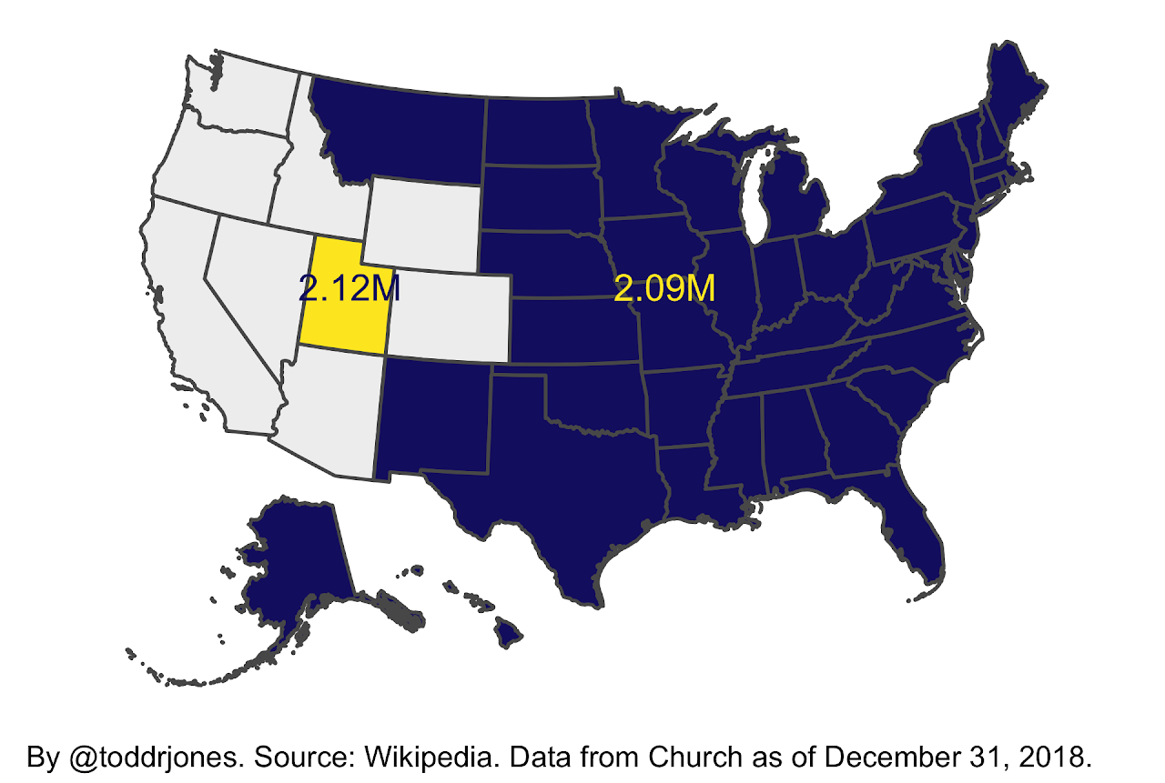
Utah has more members of the Church of Jesus Christ of Latter-day Saints than all the states colored blue combined.
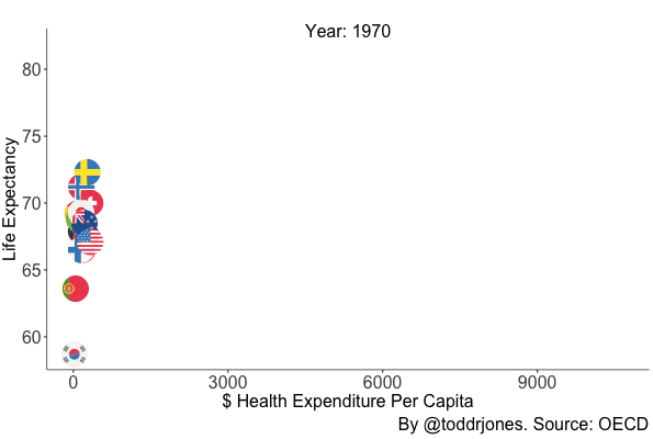
Life expectancy vs. health expenditure.
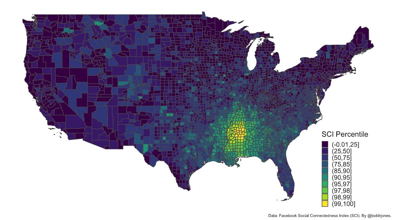
How Oktibbeha County, Mississippi is connected to other counties, using Facebook SCI data.
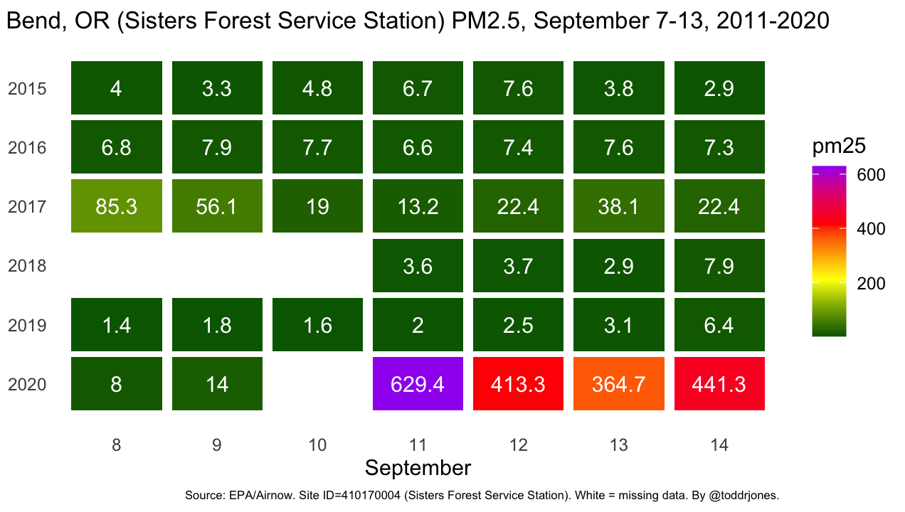
Bend, Oregon air quality (PM 2.5), September 7-13, 2011-2020. There were fires in 2020.
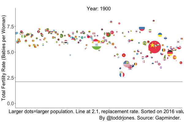
Falling fertility, 100+ years.
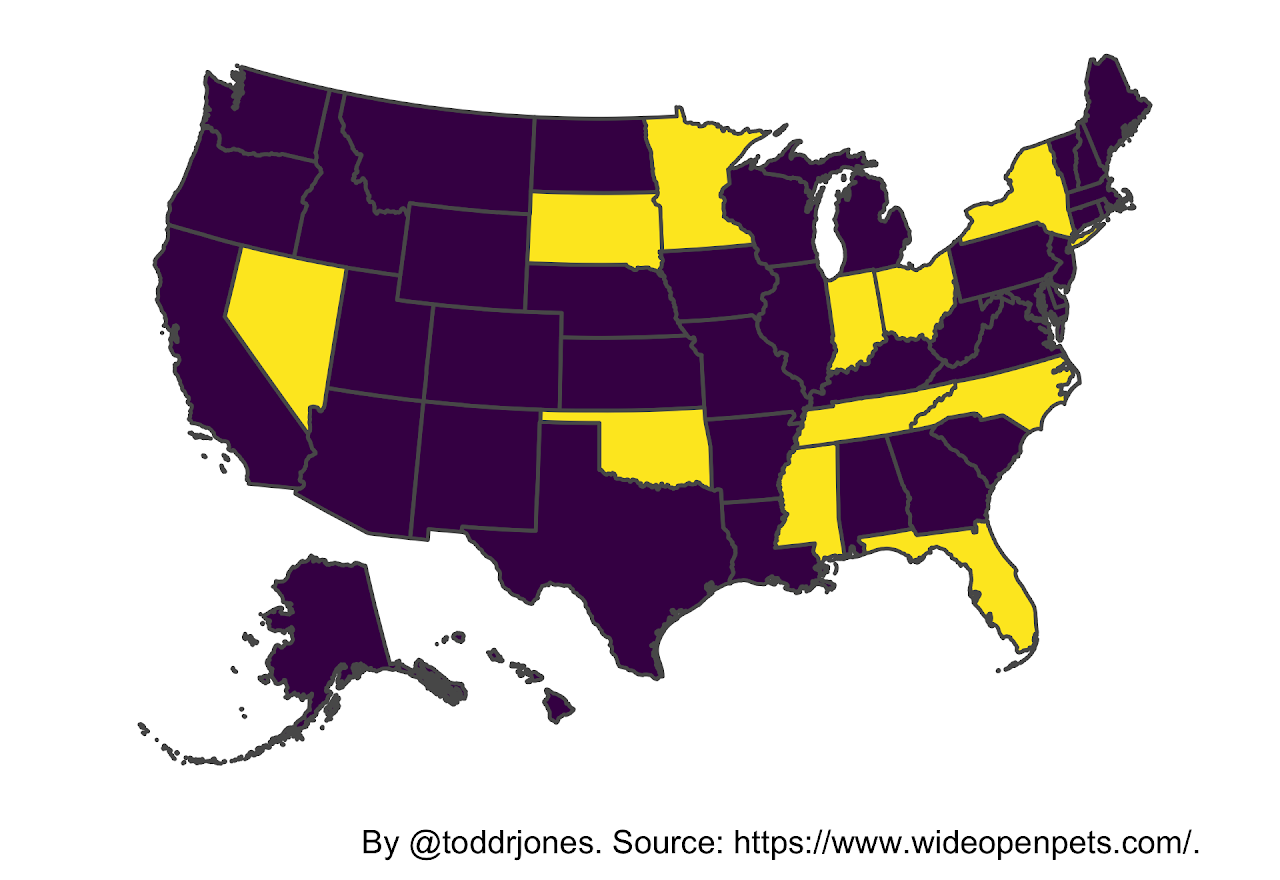
The yellow states are the states in which it is legal to own an otter.
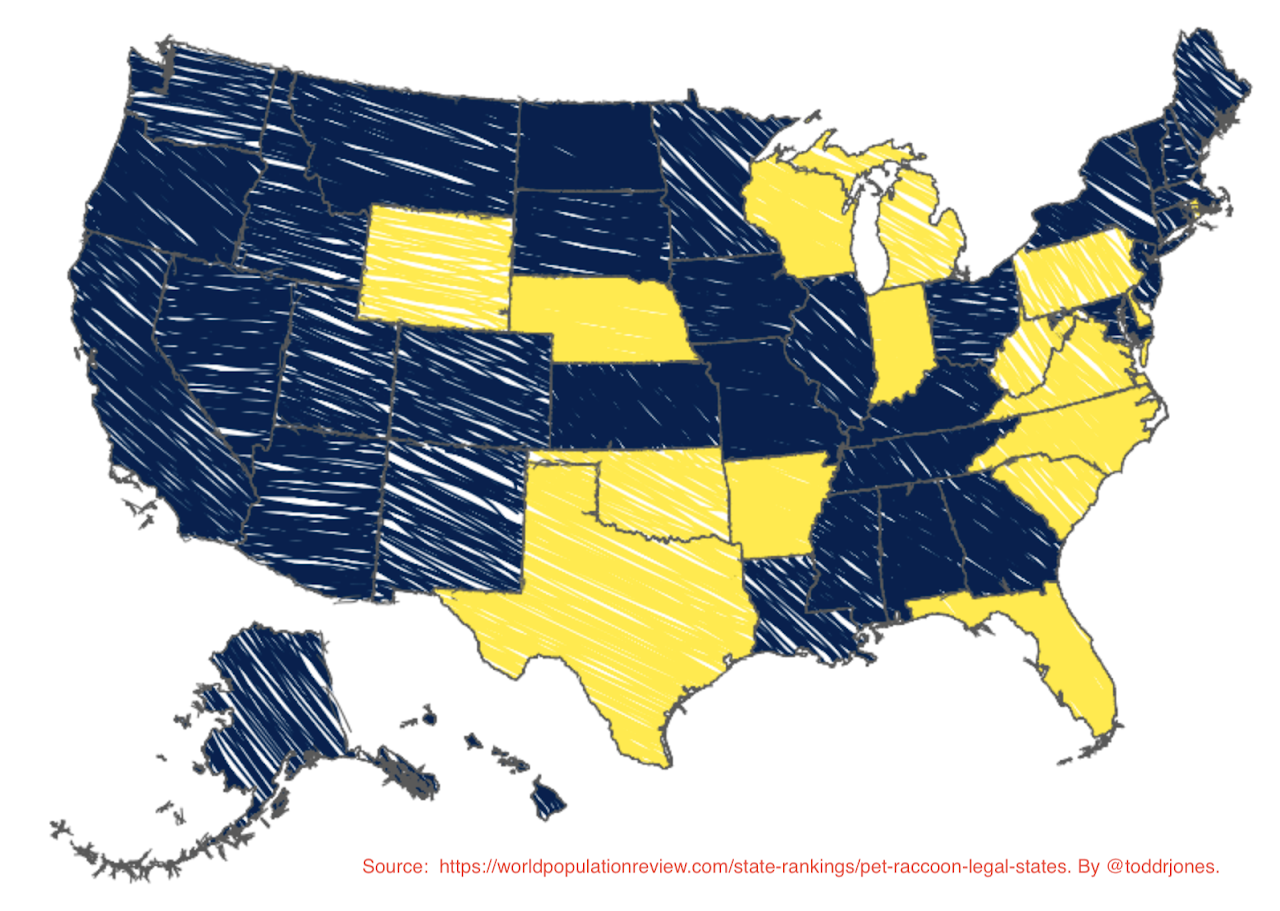
The yellow states are the states in which it is legal to own a raccoon.
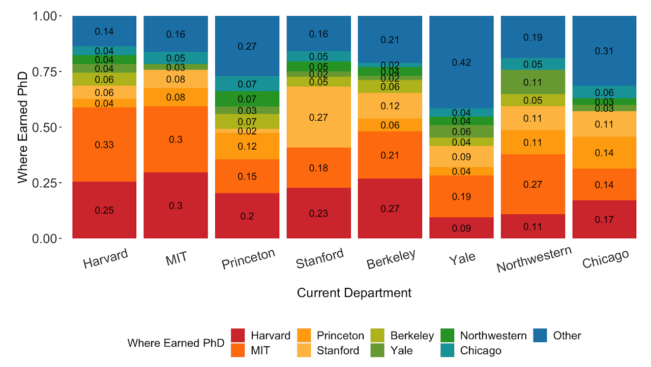
Where professors at top economics departments got their Ph.D.s.
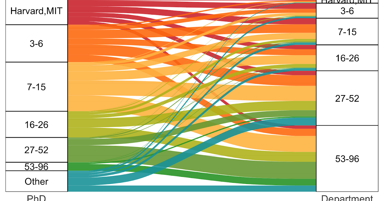
Where professors at economics departments (right) got their Ph.D.s. (left).
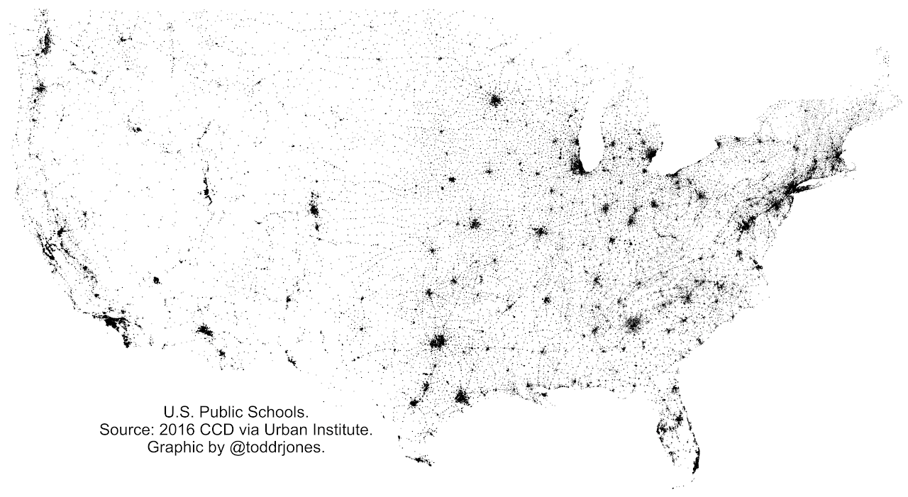
U.S. public schools
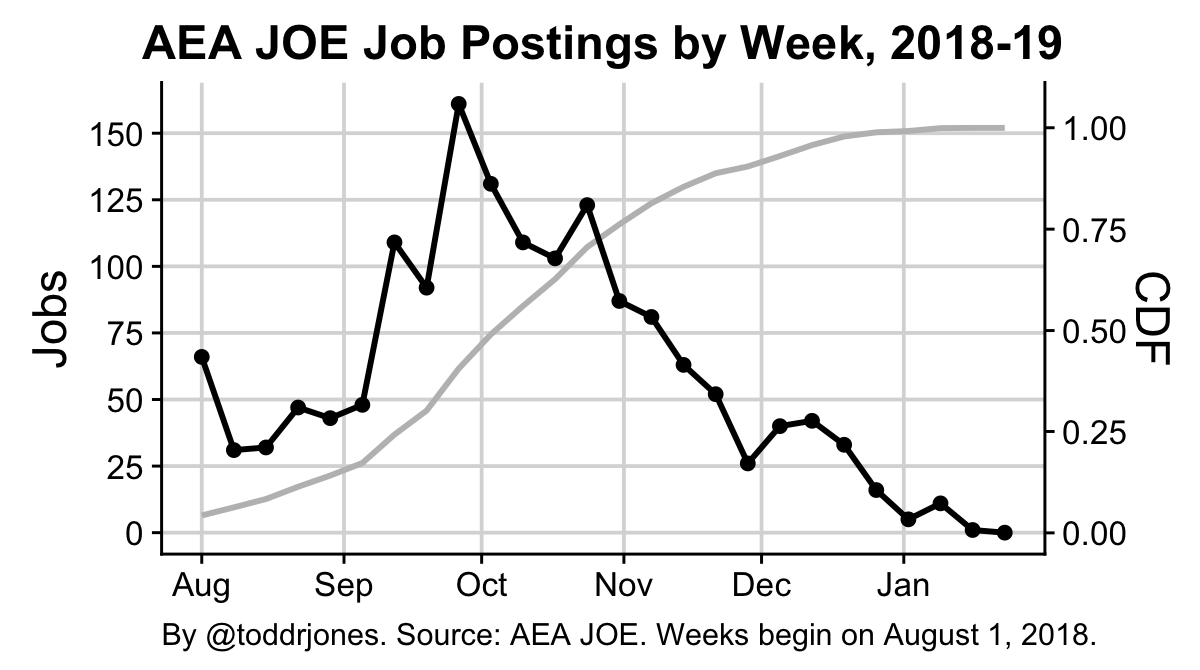
AEA JOE job postings by week, 2018-19
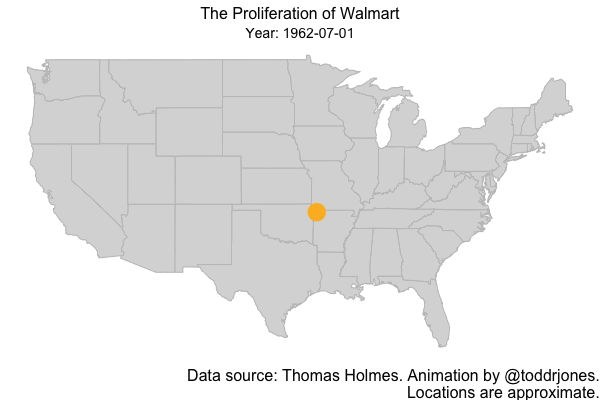
The spread of Walmart
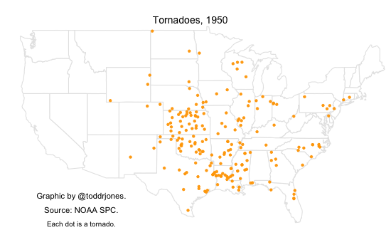
Tornadoes by year
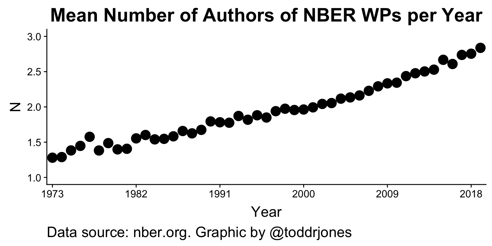
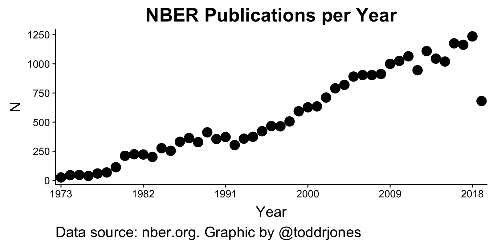
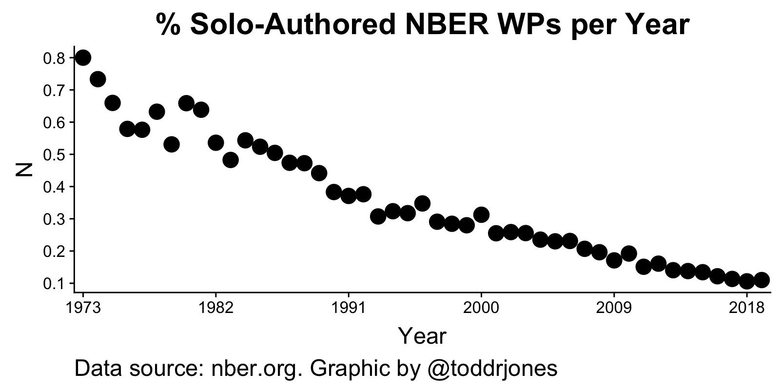
NBER publications
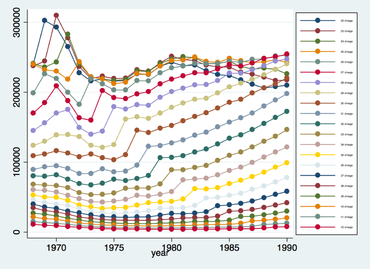
The above plot shows the total number of births by year, with each color representing a different age of mother. There is a persistent spike that occurs for mothers born in or close to 1946, presumably reflecting the increased number of individuals born in the baby boom. I used the NCHS Natality data, housed at NBER.
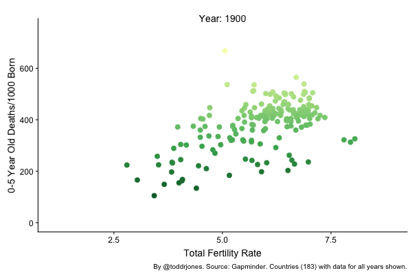
Child mortality versus total fertility rate, where each dot is a country.
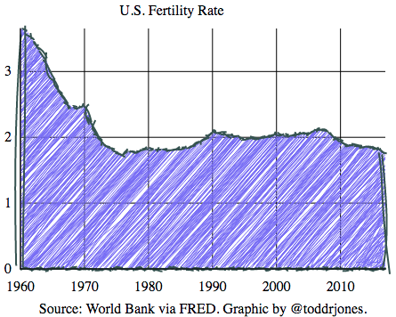
U.S. fertility rate
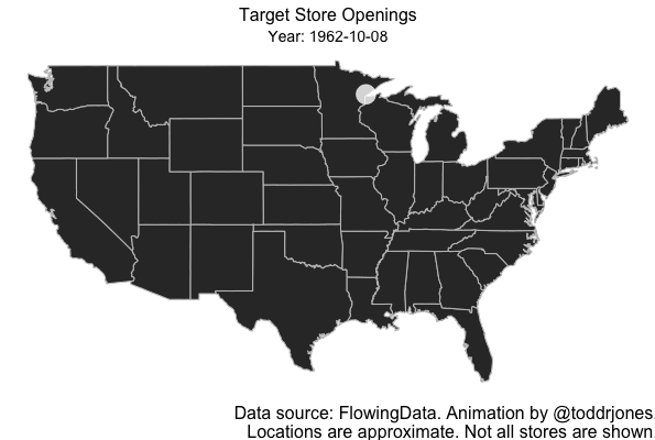
Target store openings
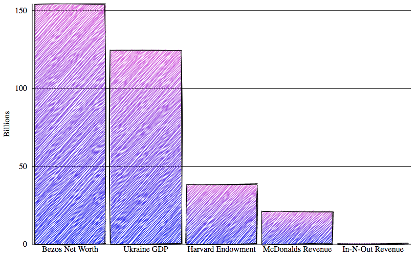
Comparisons. Source: Wikipedia. Bezos number does not reflect divorce.
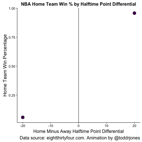
NBA team win % by halftime point differential
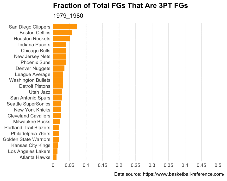
Fraction of NBA field goals that are 3 pointers
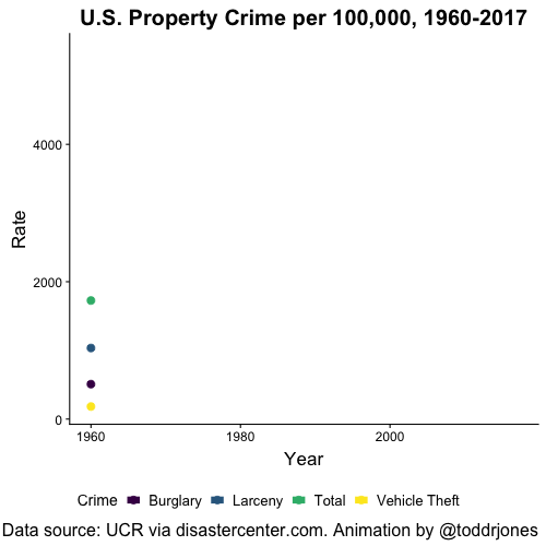
U.S. property crime over time
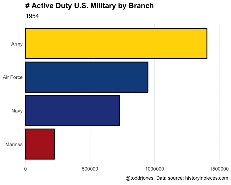
Active-duty U.S. military by branch
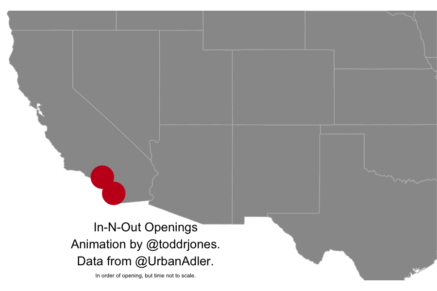
In-N-Out openings
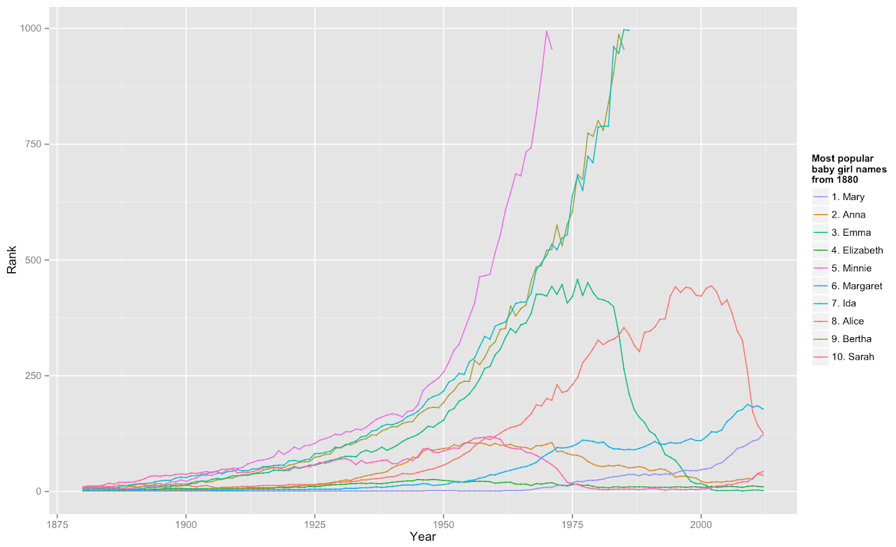
Plots of the evolution of the most popular U.S. baby girl names from 1880 to 2012, where the names shown are the top names in 1880. Data from SSA.
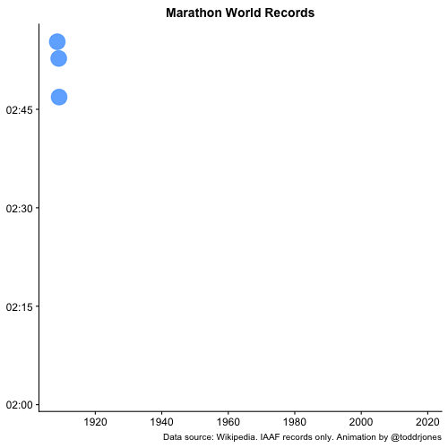
Official marathon world records over time

