Animated Plot Tutorial
First load the necessary packages:
library(tidyverse)
library(ggplot2)
library(gganimate)
library(countrycode)
library(RColorBrewer)
library(gganimate)
#devtools::install_github("rensa/ggflags")
library(ggflags)
library(ggthemes)
We will use three files, all available from https://www.gapminder.org/data/:
- GDP—income_per_person_gdppercapita_ppp_inflation_adjusted.csv.
- Click on the Income indicator.
- Child Mortality—child_mortality_0_5_year_olds_dying_per_1000_born.csv
- Click on the Child Mortality indicator.
- Total Population—population_total.csv
- Click on the Population indicator.
You can also download these files here.
If necessary, set your working directory to where you project is located.
setwd("~/")Clean the data:
gdp_w <- read.csv("files/income_per_person_gdppercapita_ppp_inflation_adjusted.csv")
mort_w <- read.csv("files/child_mortality_0_5_year_olds_dying_per_1000_born.csv")
pop_w <- read.csv("files/population_total.csv")

#data begin in 1800. keep only 1900-2018
gdp_w <- gdp_w[,c(1, 102:218)]
mort_w <- mort_w[,c(1, 102:218)]
pop_w <- pop_w[,c(1, 102:218)]

#get data from wide to long
gdp <- gather(gdp_w, Year, gdp, starts_with("X"))
mort <- gather(mort_w, Year, mort, starts_with("X"))
pop <- gather(pop_w, Year, pop, starts_with("X"))

#remove X from beginning
gdp$Year<-substring(gdp$Year, 2)
mort$Year<-substring(mort$Year, 2)
pop$Year<-substring(pop$Year, 2)

#merge
data <- merge(gdp, mort, by=c("country", "Year"))
data <- merge(data, pop, by=c("country", "Year"))

#label year
names(data)[2] <- "year"

#create log gdp variable
data$lgdp <- log(data$gdp)

#convert year to integer
data$year <- as.integer(data$year)

#merge on continent
data$continent <- countrycode(sourcevar = data[, "country"],
                              origin = "country.name",
                              destination = "continent")

#make country 2 digit to work with ggflags
data$country2 <- countrycode(as.character(data$country),
                             "country.name","iso2c")
data$country2 <- tolower(data$country2)
data$country2 <- as.character(data$country2)

#don't consider Oceania
data <- data[data$continent!="Oceania",]- Barebones. We will just plot the year 1900.
plot <- ggplot(data[data$year==1900,], aes(x=lgdp, y=mort)) +
  geom_point() +
  ylim(0, NA)
#ggsave(plot, filename="output/plot1.png", width=10,height=5.5,units='in',dpi=200)
plot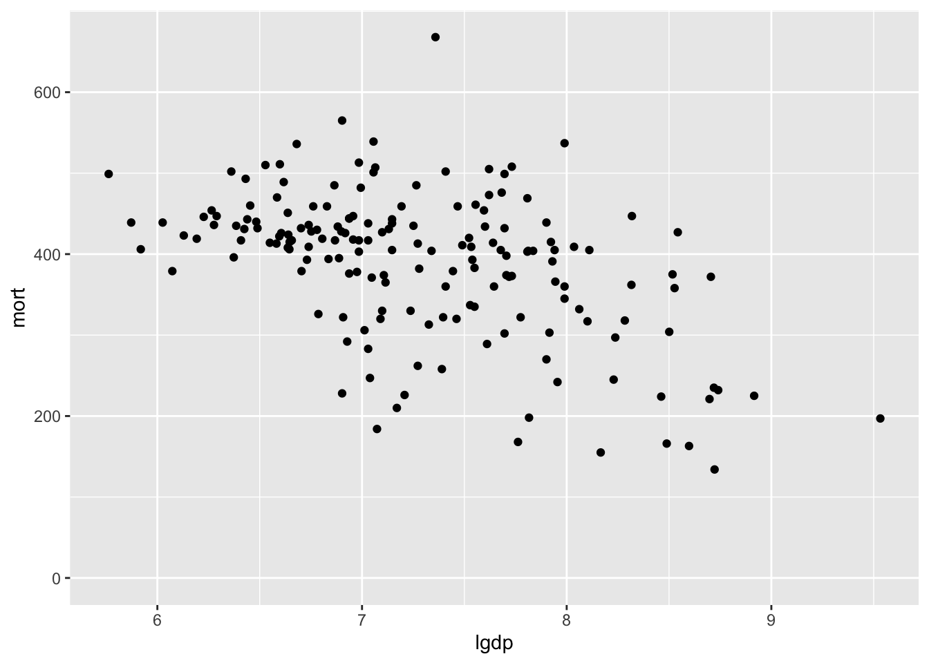
Note that you can save the static image using something like:
ggsave(plot, filename="output/plot1.png", width=10,height=5.5,units='in',dpi=200)A. Add axis labels.
plot <- ggplot(data[data$year==1900,], aes(x=lgdp, y=mort)) +
  geom_point() +
  ylim(0, NA) +
  labs(x = "Log GDP Per Capita, PPP",
       y = "0-5 Year Old Deaths/1000 Born")

plot
B. Change the labeling of the x-axis (and plot gdp, not lgdp)
plot <- ggplot(data[data$year==1900,], aes(x=gdp, y=mort)) +
  geom_point() +
  ylim(0, NA) +
  labs(x = "Log GDP Per Capita, PPP",
       y = "0-5 Year Old Deaths/1000 Born") +
  scale_x_log10(breaks=c(1000, 10000, 100000), label=scales::comma)

plot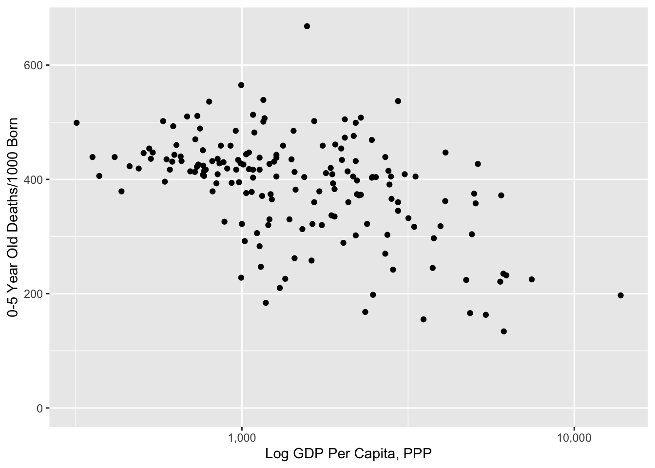
C. Change the size of the dot to reflect the country’s population
plot <- ggplot(data[data$year==1900,], aes(x=gdp, y=mort)) +
  geom_point(aes(size=pop), show.legend=FALSE) +
  scale_size_continuous(range = c(4, 25)) +
  ylim(0, NA) +
  labs(x = "Log GDP Per Capita, PPP",
       y = "0-5 Year Old Deaths/1000 Born") +
  scale_x_log10(breaks=c(1000, 10000, 100000), label=scales::comma)

plot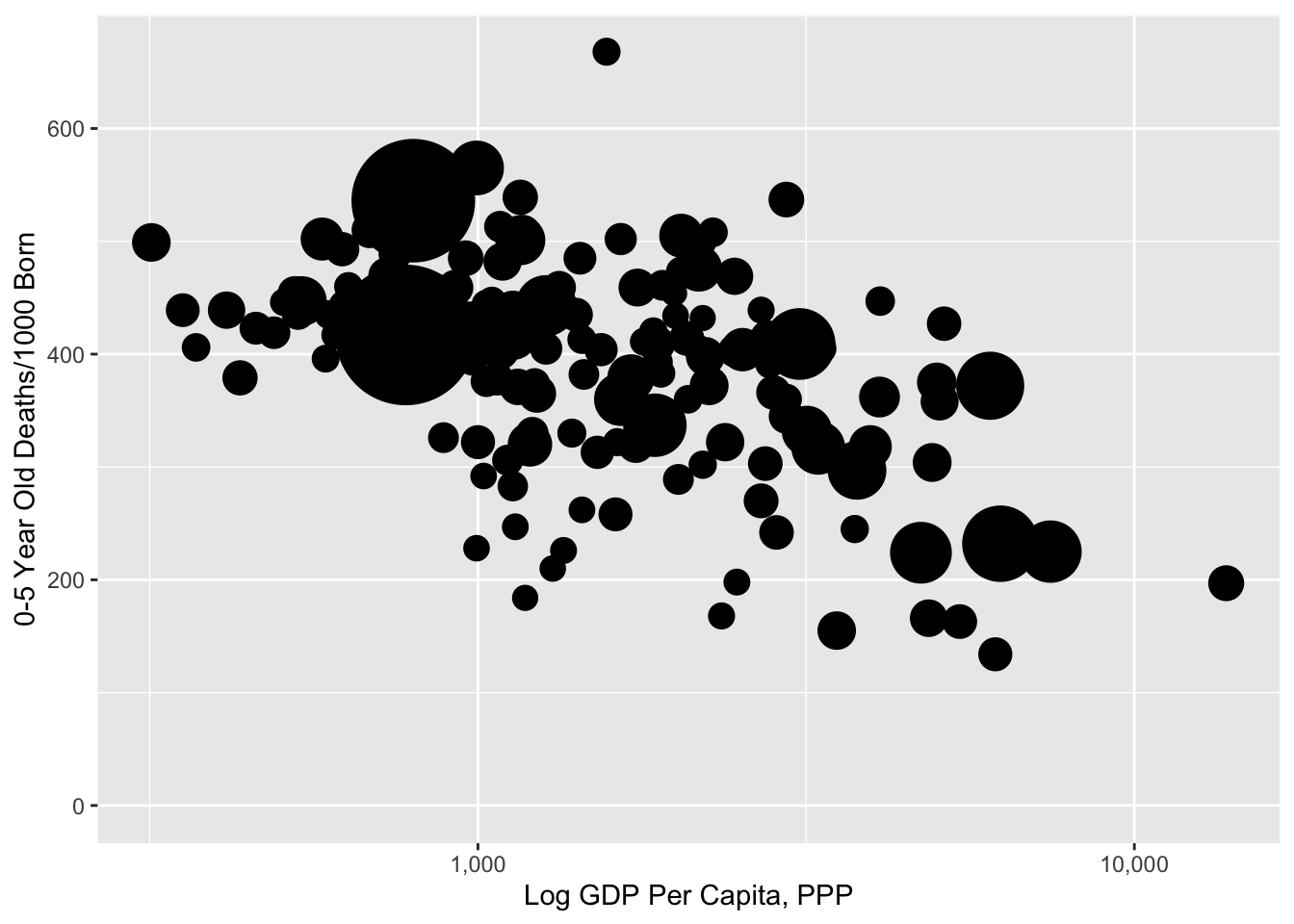
D. Change color of dots (to be the y-variable)
colourCount = length(unique(data$mort))
getPalette = colorRampPalette(brewer.pal(9, "Blues"))
plot <- ggplot(data[data$year==1900,], aes(x=gdp, y=mort)) +
  geom_point(aes(size=pop, col=mort), show.legend=FALSE) +
  scale_colour_gradientn(colours=rev(getPalette(1444)[700:1444])) +
  scale_size_continuous(range = c(4, 25)) +
  ylim(0, NA) +
  labs(x = "Log GDP Per Capita, PPP",
       y = "0-5 Year Old Deaths/1000 Born") +
  scale_x_log10(breaks=c(1000, 10000, 100000), label=scales::comma)

plot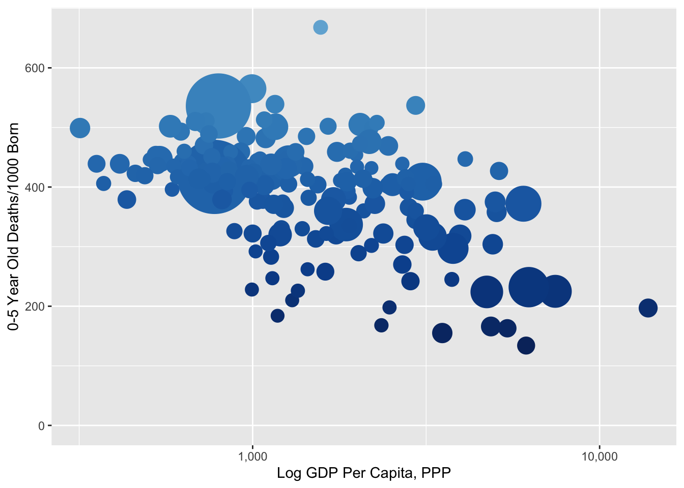
E. Add opacity to the dots
plot <- ggplot(data[data$year==1900,], aes(x=gdp, y=mort)) +
  geom_point(aes(size=pop, col=mort), alpha=.7, show.legend=FALSE) +
  scale_colour_gradientn(colours=rev(getPalette(1444)[700:1444])) +
  scale_size_continuous(range = c(4, 25)) +
  ylim(0, NA) +
  labs(x = "Log GDP Per Capita, PPP",
       y = "0-5 Year Old Deaths/1000 Born") +
  scale_x_log10(breaks=c(1000, 10000, 100000), label=scales::comma)

plot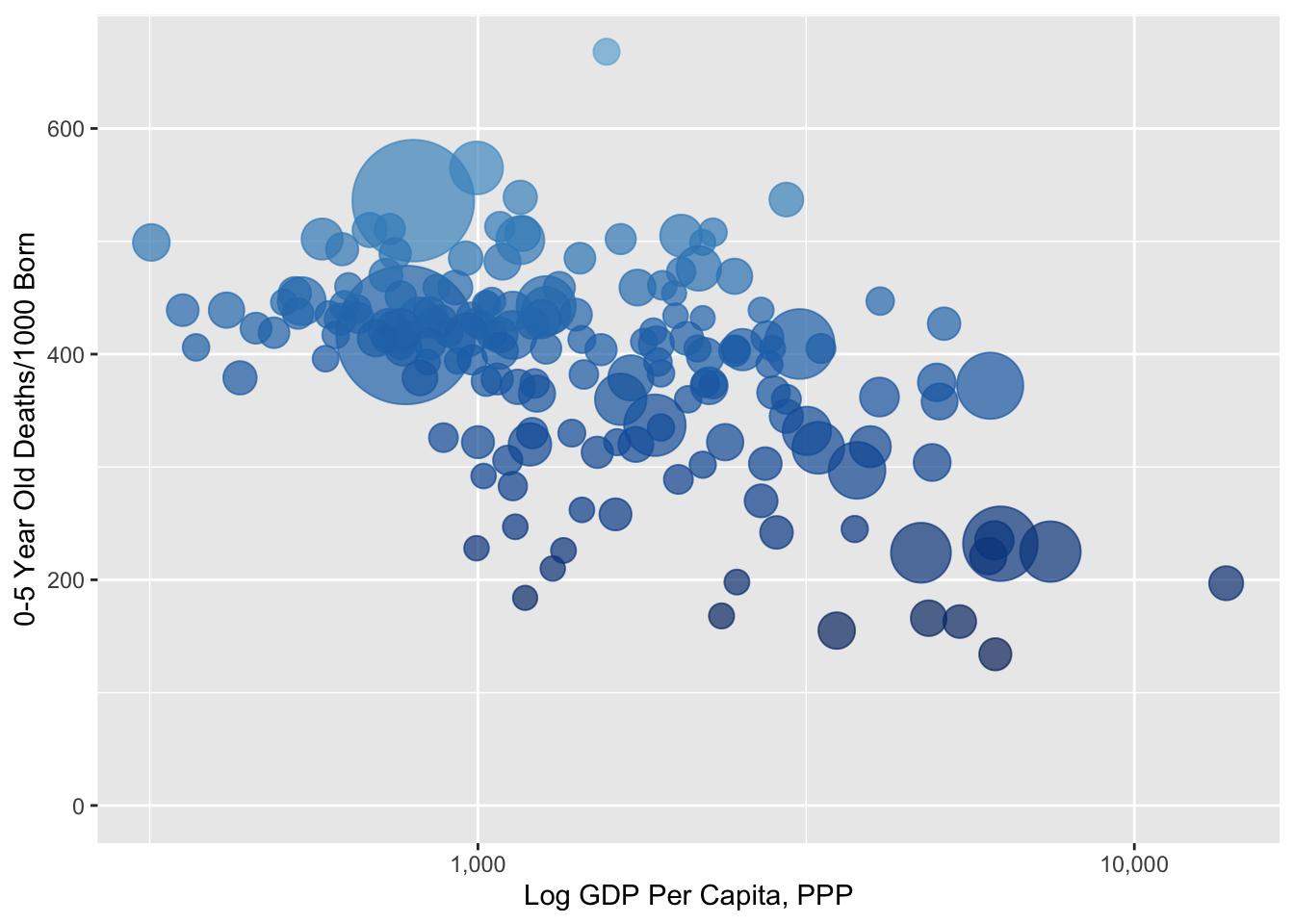
F. Change the background from grey to white
plot <- ggplot(data[data$year==1900,], aes(x=gdp, y=mort)) +
  geom_point(aes(size=pop, col=mort), alpha=.7, show.legend=FALSE) +
  scale_colour_gradientn(colours=rev(getPalette(1444)[700:1444])) +
  scale_size_continuous(range = c(4, 25)) +
  ylim(0, NA) +
  labs(x = "Log GDP Per Capita, PPP",
       y = "0-5 Year Old Deaths/1000 Born") +
  scale_x_log10(breaks=c(1000, 10000, 100000), label=scales::comma) +
  theme(panel.background = element_rect(fill = 'white', colour = 'white'))

plot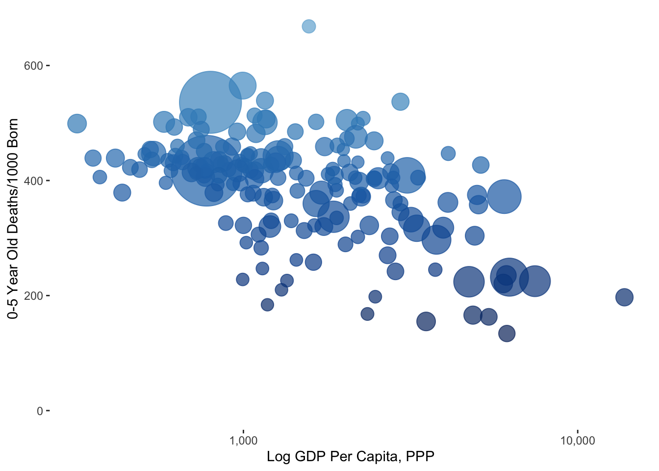
G. Add in black axis lines
plot <- ggplot(data[data$year==1900,], aes(x=gdp, y=mort)) +
  geom_point(aes(size=pop, col=mort), alpha=.7, show.legend=FALSE) +
  scale_colour_gradientn(colours=rev(getPalette(1444)[700:1444])) +
  scale_size_continuous(range = c(4, 25)) +
  ylim(0, NA) +
  labs(x = "Log GDP Per Capita, PPP",
       y = "0-5 Year Old Deaths/1000 Born") +
  scale_x_log10(breaks=c(1000, 10000, 100000), label=scales::comma) +
  theme(panel.background = element_rect(fill = 'white', colour = 'white')) +
  theme(axis.line = element_line(size = .6, colour = "black"))

plot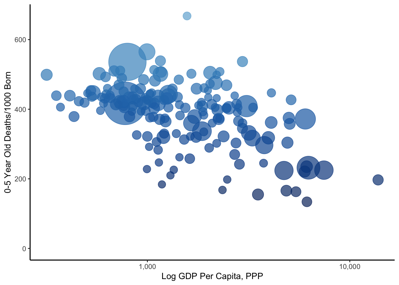
H. Make the y axis start right at 0
plot <- ggplot(data[data$year==1900,], aes(x=gdp, y=mort)) +
  geom_point(aes(size=pop, col=mort), alpha=.7, show.legend=FALSE) +
  scale_colour_gradientn(colours=rev(getPalette(1444)[700:1444])) +
  scale_size_continuous(range = c(4, 25)) +
  expand_limits(y=0) +
  labs(x = "Log GDP Per Capita, PPP",
       y = "0-5 Year Old Deaths/1000 Born") +
  scale_x_log10(breaks=c(1000, 10000, 100000), label=scales::comma) +
  theme(panel.background = element_rect(fill = 'white', colour = 'white')) +
  theme(axis.line = element_line(size = .6, colour = "black"))+
  scale_y_continuous(expand = c(0, 0))

plot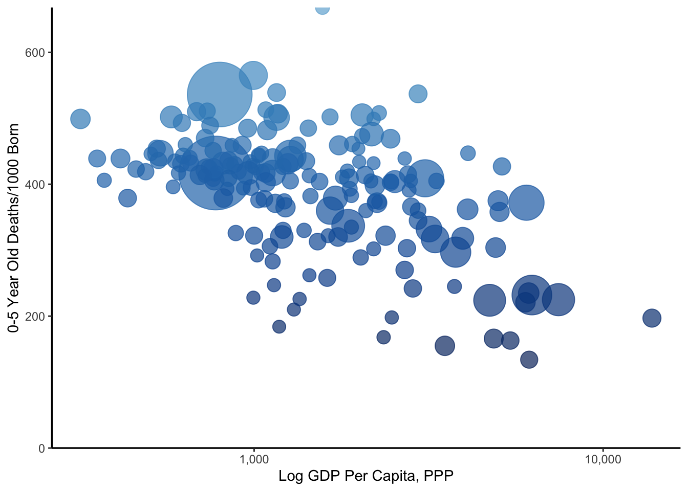
I. Increase the size of the labels
plot <- ggplot(data[data$year==1900,], aes(x=gdp, y=mort)) +
  geom_point(aes(size=pop, col=mort), alpha=.7, show.legend=FALSE) +
  scale_colour_gradientn(colours=rev(getPalette(1444)[700:1444])) +
  scale_size_continuous(range = c(4, 25)) +
  expand_limits(y=0) +
  labs(x = "Log GDP Per Capita, PPP",
       y = "0-5 Year Old Deaths/1000 Born") +
  scale_x_log10(breaks=c(1000, 10000, 100000), label=scales::comma) +
  theme(panel.background = element_rect(fill = 'white', colour = 'white')) +
  theme(axis.line = element_line(size = .6, colour = "black"))+
  scale_y_continuous(expand = c(0, 0)) +
  theme(plot.title = element_text(size=22)) +
  theme(plot.caption = element_text(size=16)) +
  theme(plot.title = element_text(hjust = 0.5)) +
  theme(plot.subtitle = element_text(size=16, hjust = 0.5, vjust=-10)) +
  theme(axis.text=element_text(size=16), axis.title=element_text(size=16))

plot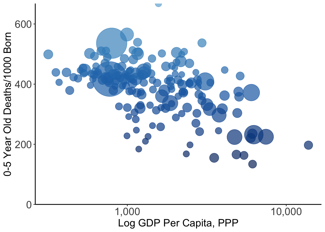
J. Add captions
plot <- ggplot(data[data$year==1900,], aes(x=gdp, y=mort)) +
  geom_point(aes(size=pop, col=mort), alpha=.7, show.legend=FALSE) +
  scale_colour_gradientn(colours=rev(getPalette(1444)[700:1444])) +
  scale_size_continuous(range = c(4, 25)) +
  expand_limits(y=0) +
  labs(x = "Log GDP Per Capita, PPP",
       y = "0-5 Year Old Deaths/1000 Born") +
  scale_x_log10(breaks=c(1000, 10000, 100000), label=scales::comma) +
  theme(panel.background = element_rect(fill = 'white', colour = 'white')) +
  theme(axis.line = element_line(size = .6, colour = "black"))+
  scale_y_continuous(expand = c(0, 0)) +
  theme(plot.title = element_text(size=22)) +
  theme(plot.caption = element_text(size=16)) +
  theme(plot.title = element_text(hjust = 0.5)) +
  theme(plot.subtitle = element_text(size=16, hjust = 0.5, vjust=-10)) +
  theme(axis.text=element_text(size=16), axis.title=element_text(size=16)) +
  labs(caption = "By @toddrjones. Source: Gapminder. ")

plot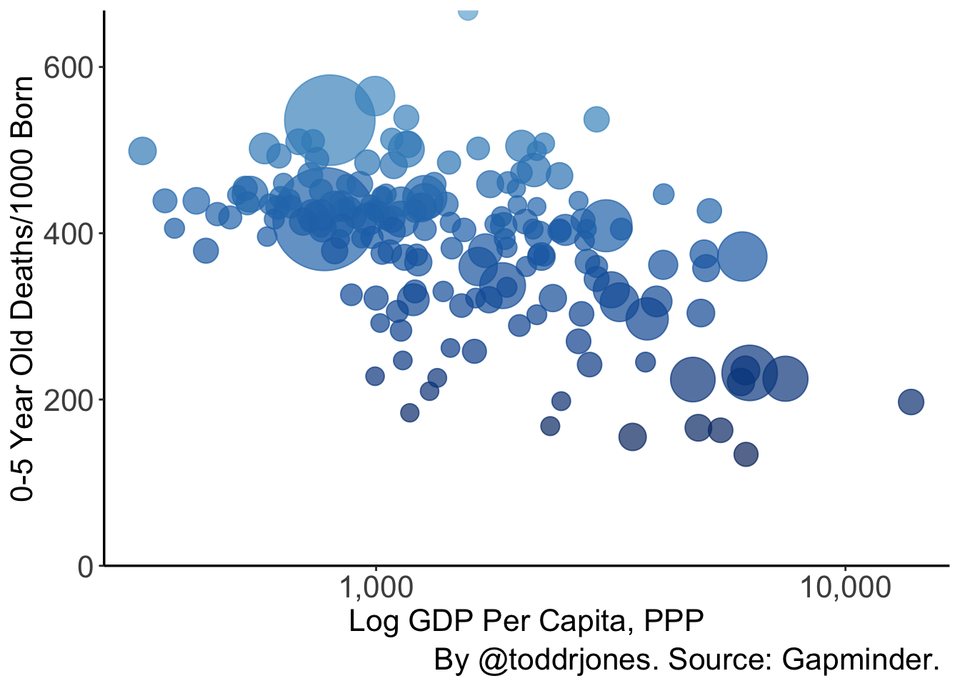
K. Animate
plot <- ggplot(data, aes(x=gdp, y=mort)) +
  geom_point(aes(size=pop, col=mort), alpha=.7, show.legend=FALSE) +
  scale_colour_gradientn(colours=rev(getPalette(1444)[700:1444])) +
  scale_size_continuous(range = c(4, 25)) +
  expand_limits(y=0) +
  labs(x = "Log GDP Per Capita, PPP",
       y = "0-5 Year Old Deaths/1000 Born") +
  scale_x_log10(breaks=c(1000, 10000, 100000), label=scales::comma) +
  theme(panel.background = element_rect(fill = 'white', colour = 'white')) +
  theme(axis.line = element_line(size = .6, colour = "black"))+
  scale_y_continuous(expand = c(0, 0)) +
  theme(plot.title = element_text(size=22)) +
  theme(plot.caption = element_text(size=16)) +
  theme(plot.title = element_text(hjust = 0.5)) +
  theme(plot.subtitle = element_text(size=16, hjust = 0.5, vjust=-13)) +
  theme(axis.text=element_text(size=16), axis.title=element_text(size=16)) +
  labs(caption = "By @toddrjones. Source: Gapminder. ")  +
  transition_time(year) +
  labs(subtitle = paste('Year: {frame_time}'))

plot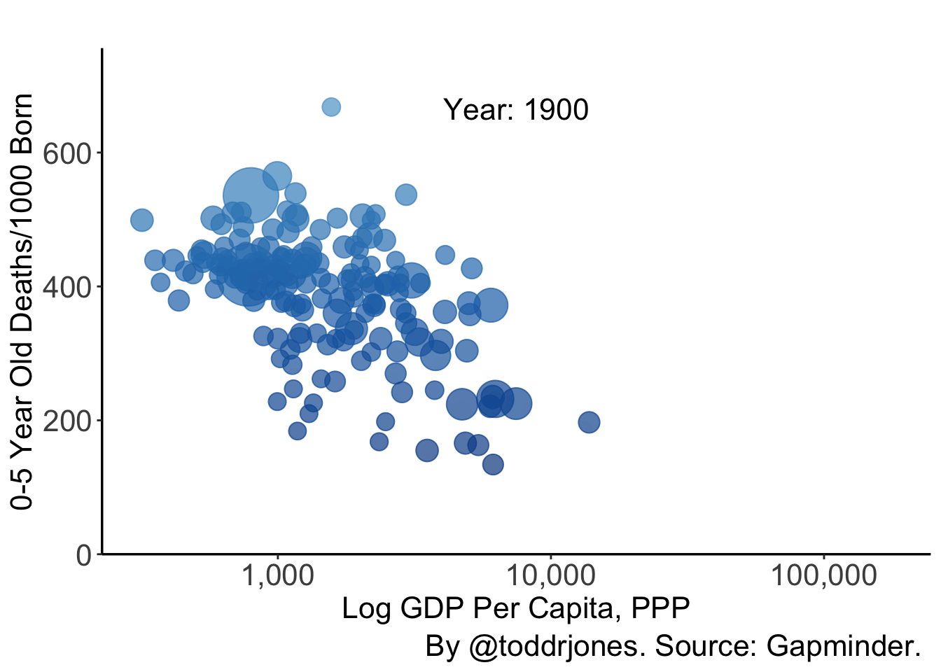
Note that you can save the static image using something like:
anim_save("output/plot1l.gif", plot2, end_pause=8, width = 600, height = 400, duration=11, nframes=220)L. Split into continents using facet
plot2 <- plot + facet_wrap(. ~ continent, ncol=2) + theme(strip.text = element_text(size=17))
plot2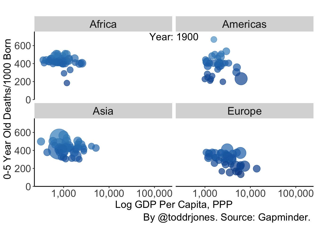
M. Change the dots to flags
plot <- ggplot(data, aes(x=gdp, y=mort)) +
  geom_flag(aes(size=pop, country=country2), show.legend=FALSE) +
  scale_colour_gradientn(colours=rev(getPalette(1444)[700:1444])) +
  scale_size_continuous(range = c(4, 25)) +
  expand_limits(y=0) +
  labs(x = "Log GDP Per Capita, PPP",
       y = "0-5 Year Old Deaths/1000 Born") +
  scale_x_log10(breaks=c(1000, 10000, 100000), label=scales::comma) +
  theme(panel.background = element_rect(fill = 'white', colour = 'white')) +
  theme(axis.line = element_line(size = .6, colour = "black"))+
  scale_y_continuous(expand = c(0, 0)) +
  theme(plot.title = element_text(size=22)) +
  theme(plot.caption = element_text(size=16)) +
  theme(plot.title = element_text(hjust = 0.5)) +
  theme(plot.subtitle = element_text(size=16, hjust = 0.5, vjust=-13)) +
  theme(axis.text=element_text(size=16), axis.title=element_text(size=16)) +
  labs(caption = "By @toddrjones. Source: Gapminder. ")  +
  transition_time(year) +
  labs(subtitle = paste('Year: {frame_time}')) +
  facet_wrap(. ~ continent, ncol=2) + theme(strip.text = element_text(size=17))

plot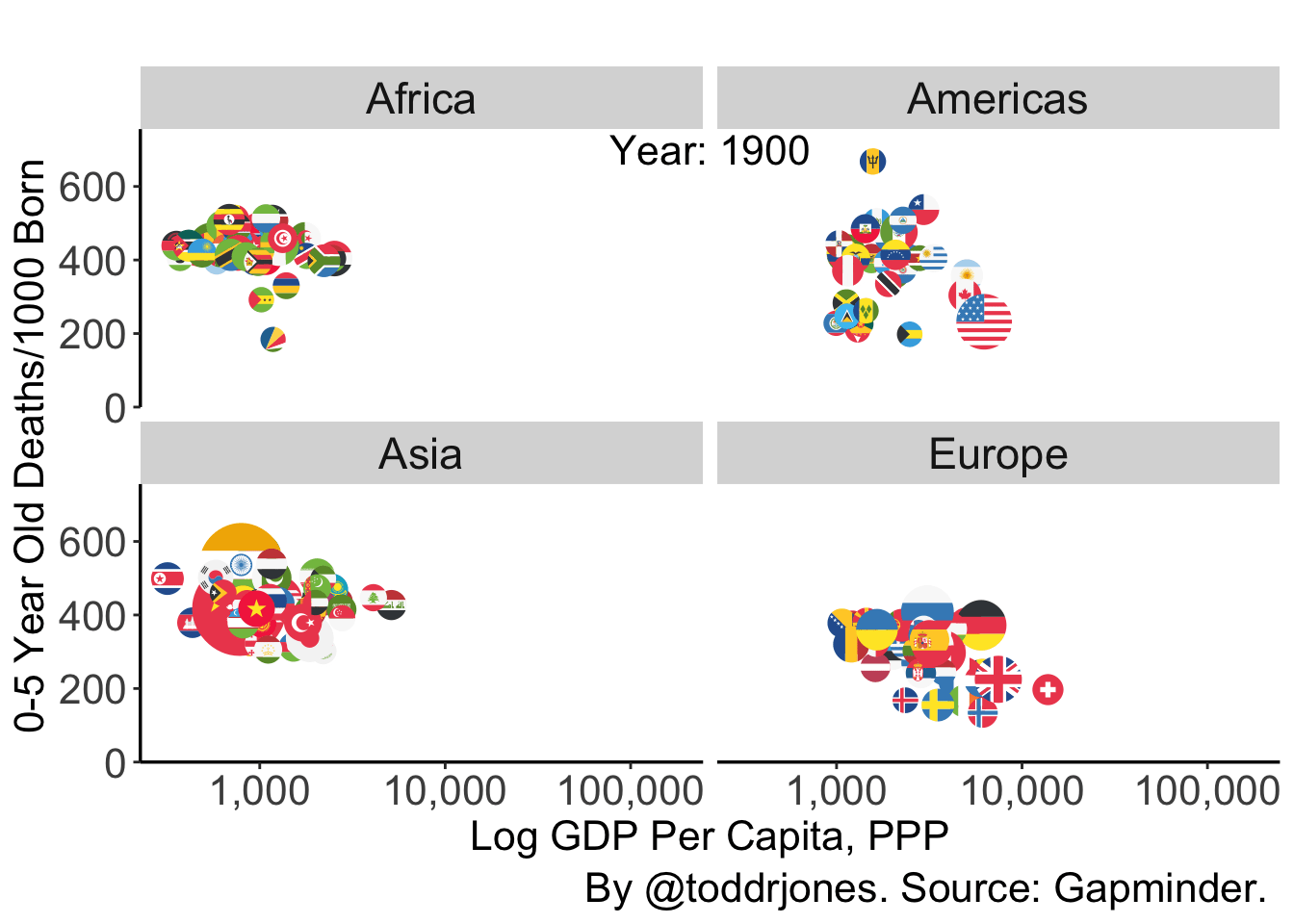
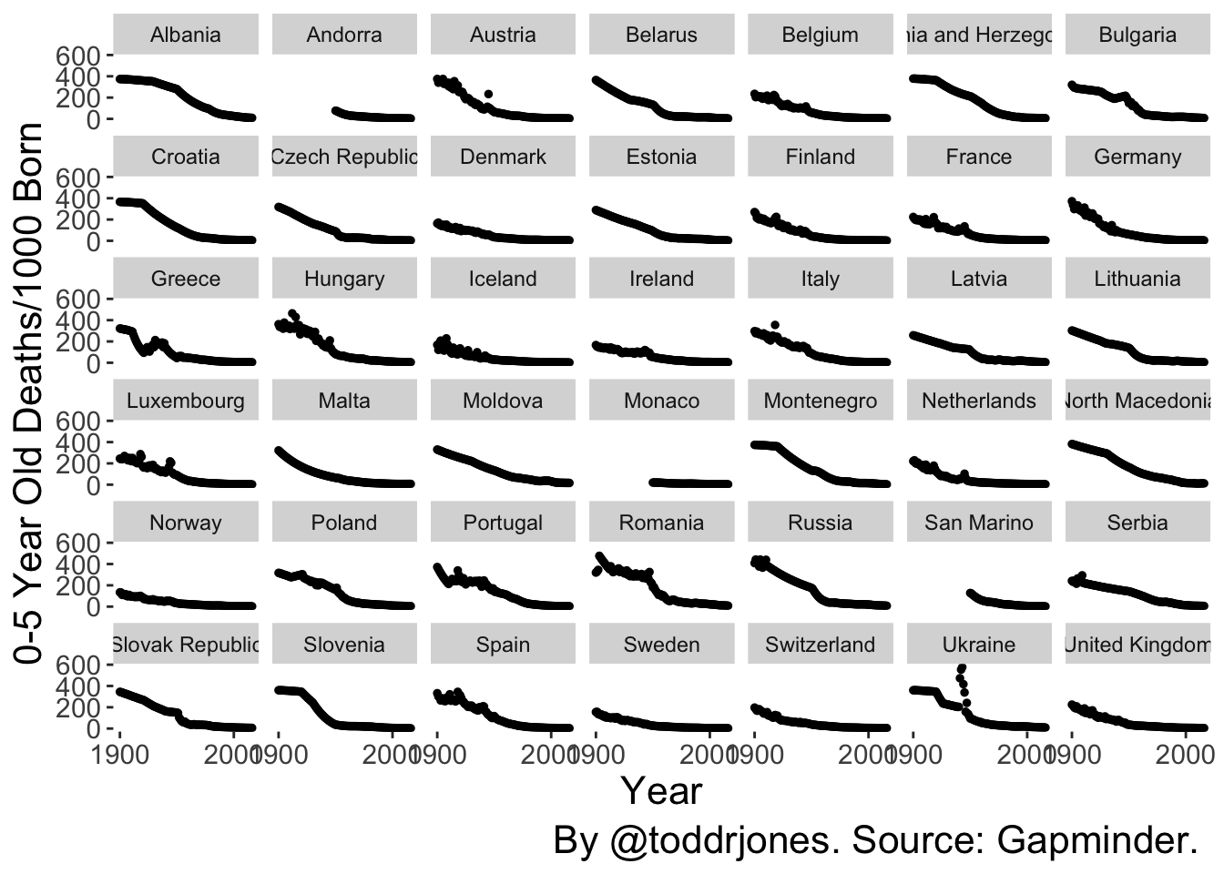
N. Go away from animation and instead display using small multiples
plot <- ggplot(data[data$continent=="Europe",], aes(x=year, y=mort)) +
  geom_point(size=1, show.legend=FALSE) +
  theme(panel.background = element_rect(fill = 'white', colour = 'white')) +
  theme(plot.title = element_text(size=22)) +
  theme(plot.caption = element_text(size=16)) +
  theme(plot.title = element_text(hjust = 0.5)) +
  theme(plot.subtitle = element_text(size=16, hjust = 0.5, vjust=-10)) +
  theme(axis.text=element_text(size=16), axis.title=element_text(size=16)) +
  labs(x = "Year",
       y = "0-5 Year Old Deaths/1000 Born") +
  labs(caption = "By @toddrjones. Source: Gapminder. ") +
  ylim(0, NA) +
  facet_wrap(. ~ country) +
  scale_x_continuous(breaks=c(1900, 2000)) +
  theme(axis.text.x=element_text(size=rel(0.7))) +
  theme(axis.text.y=element_text(size=rel(0.7)))

plot